Megan Francis G321 Foundation Portfolio
Thursday 18 April 2013
Final Result
My task was to produce a music magazine with a chosen target audience of my choice. I feel that my design that I have produced include element of conventions that exist in past and present products. I had to research conventions and stereotypes to develop my final design. I looked at specific aspects of indie rock magazines and other magazines that could influence key aspects and decisions that I had to make. The key aspect that are included where; a mast head, a key image, and cover lines. I looked at content pages as well as cover pages, the conventions on a content page changes slightly but also linking with a house style relation to the cover page. A convention of a content page also has a key image and cover lines as the contents page is to help the audience know what the magazine contains. I used all of these features for my final development as it made my magazine and contents page more realistic and professional. I also had to look at a double page spread including a colour scheme that links with the rest of the magazine, masthead, images quotes and text.
My target audience was mainly targeted at males 13+. I decided to have an indie rock magazine that covered rock culture; containing all interests to all subjects like gig dates, artist, release date. Therefore it would have a wider target audience as all interests are provided in the magazine. The cover lines express this as they consist of different aspects to the audience either it being to do with artists and music.
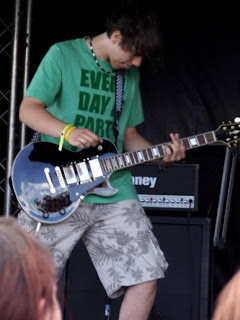
The institution that would distribute my magazine would be suburban and urban locations as I focused my magazine based around a music genre people are located everywhere. Also the audience that I have aimed my media product to is 13+ old males as this is the particular age range that would most likely read my magazine, but also would interest females creating an even wider target audience. You can see that this chosen target audience is appropriate by the way the magazine has been presented as a consistent house style has been used of bright colour being; yellow, red and black these colours are used stereotypical within the rock genre. This provides the presentation of the magazine to look bright and colourful engaging the audience also the house style is carried through to my contents and double page spread therefore it interests the audience much more. By having a key image of a celebrity helps influence the audience as this reflects on the target audience as they would appeal to this celebrity endorsement and would be attracted by fans as a possible role model and who like the rock genre can relate to the style and music of rock. As the contents page has one main insert images this influences the target audience to want to read on as they would want to find out more about that specific story. Also there are linked images added to engage the audience further showing the band in action.
The technologies that I have learnt for this particularly media product are helpful as the research and development shows that I have gone into depth in my research to gain a wider understanding of how certain magazines are to be presented this helped me for this task as existing magazine gave me a idea of stereotypes and conventions within the magazine genre. Existing magazines have inspired and guided me showing me how my product should result in. I used Adobe InDesign to create my media product; I used many skills to crate my indie rock music magazine, which will help me within the future.
Wednesday 10 April 2013
Wednesday 20 March 2013
Subscribe to:
Posts (Atom)


